Roster — Layout exploration
The new image-makers.
Three layouts for the talent grid. Each renders the same dataset — swap the one you want into the main site Talent section.
Option A
Replace category cards with artist cards
The cleanest path. Drops the discipline tiles entirely and shows individual artists as the primary unit. Best when you have enough roster to fill a grid (8+ artists).

Wayan Palmieri
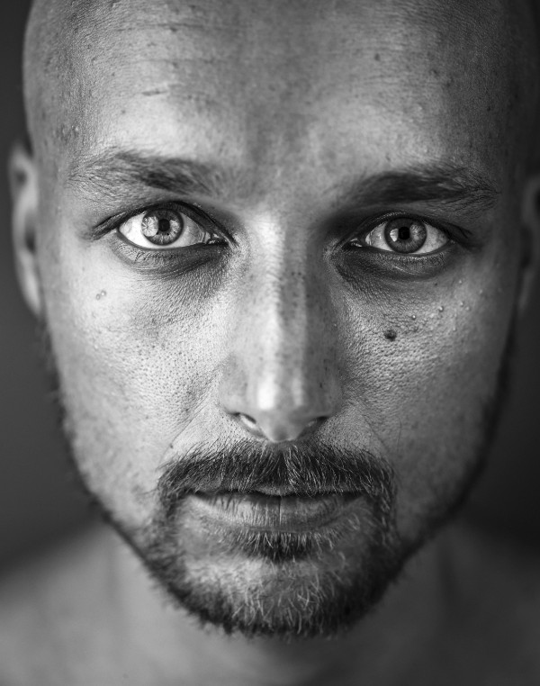
Miguel Angelo Pate

Ant Neely

Vasha Narace Van Heertum

LOGIK (Julian Gilliam)

James Maze

Adrian Daniel Botnariu

Fill Isgro

Julien Durand
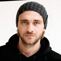
Michal Jan Owerczuk
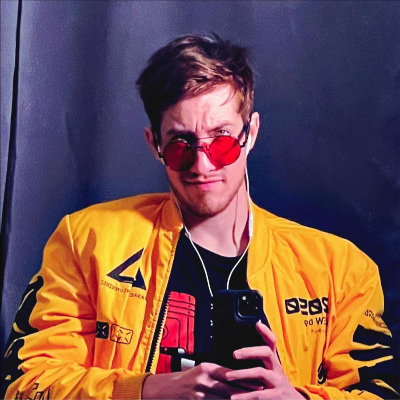
Brogan Wassell

Themo Melikidze

Gilberto Balderas

Davis Chang
Option B
Categories at top, artist grid below
Discipline strip stays as a quick overview, full roster sits beneath. Useful while the roster is small — the disciplines do the heavy lifting visually.
Disciplines
01
AI Filmmaker
0 on roster
02
AI Artist
11 on roster
03
Creative Technologist
3 on roster
04
Director
0 on roster
05
Designer
0 on roster
06
Editor
0 on roster
07
VFX / Post
0 on roster
Roster
Wayan Palmieri
Miguel Angelo Pate
Ant Neely
Vasha Narace Van Heertum
LOGIK (Julian Gilliam)
James Maze
Adrian Daniel Botnariu
Fill Isgro
Julien Durand
Michal Jan Owerczuk
Brogan Wassell
Themo Melikidze
Gilberto Balderas
Davis Chang
Option C
Filter chips over a single grid
One grid, filterable by discipline. Scales well as the roster grows past ~20 artists. Feels more like a talent agency directory.
Wayan Palmieri
Miguel Angelo Pate
Ant Neely
Vasha Narace Van Heertum